ClickShip
Being the lead designer, I was responsible for revamping the brand identity across all UI screens, designing new features, and becoming a product specialist. ClickShip was relevantly brand new and needed a holistic design that was a modern SaaS platform but was friendly for newcomers in the shipping space.
Role
UX/UI Design
Prototyping
User Research
Wireframing
Programs Used
Figma
Problem
The problem that we faced for new sign-ups was users completed the onboarding but didn't know what to do after landing on the dashboard. The sales representatives for those customers didn't have any prior information from onboarding to understand why they weren’t using the platform actively after they signed up.
Doing some research and survey questions within our internal teams, after speaking with the sales department about what questions they normally ask when vetting their prospects, we noticed common questions being asked during the screen calling and decided to take those questions and bring them over to the new onboarding experience. One: so customers are asked for contextual information about their eCommerce business, and two: that information can be used by the sales representative to further provide solutions tailored to their needs.
During the process, we laid out how many questions are asked during the old onboarding process which came to be around 16 input fields that required to be filled out. With that many questions, that can cause serious friction points for the user.
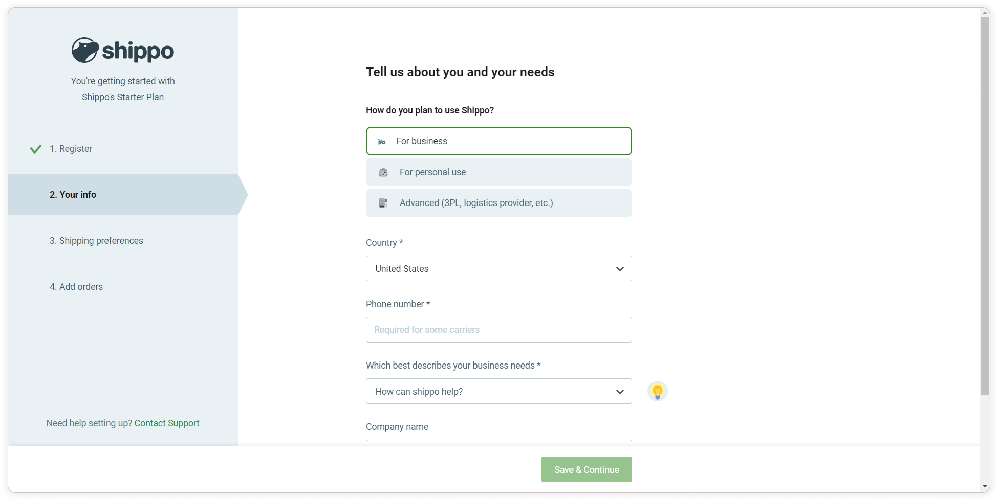
A simple way to answer questions
Providing multiple choice questions could quickly be done with dropdowns, but each question would require a click and then a glance at all the options available in that dropdown. Because we ask questions that could have numerous options as answers, displaying all the answers at once where users can click on one (or multiple if applicable) streamlines the process.
Competitive Analysis
When looking at sign up pages, most of the time, it is all input fields and dropdowns. When there are multiple options to choose from, that can lead to a lot of clicks which means a longer time looking at the options and time spent on the sign-up page.

Sign Up/Login Page

Asking users about their business and operations

What kind of eCommerce stores do you have?

Finding out how users came across ClickShip as the last step
Complete their profile by providing a goal
Providing multiple choice questions could quickly be done with dropdowns, but each question would require a click and then a glance at all the options available in that dropdown. Because we ask questions that could have numerous options as answers, displaying all the answers at once where users can click on one (or multiple if applicable) streamlines the process.